Kamis, 29 Oktober 2009

ARCH 1142 Communication

I had Architecture in motion for the first workshop. It was really new thing for me, in which I have never doing this kind of animation, however it was very fun. From this workshop, I have learnt how to produce simple animation by using multiple simple hand sketches. Those sketches then are combined to make animation by using video maker software. This workshop taught me how to communicate our idea through a media call animation or a moving drawings. In addition, After entering this workshop, I have become more familiar to red center.

The second workshop was Modelling Workshop. This workshop had us to explore 2d poster and 3d model from different kind of material to convey our thought. I have a very tough time in this workshop, in which my poster-making ability was not good and also, it was hard for me to explain what I am thinking through the model that I made. However, I have learn to communicate our thought through the 2d poster and 3d model from this workshop.

The last workshop was Fluid Thoughts to Action Workshop. During this workshop I have learnt to do water colour and charcoal drawings. We are taught to see things in different way, in which the workshop has us to convey the moving objects in a drawing. Also we are taught to be more careful in doing drawing and concern about how to convey reflected light (shadow) by using material of ink or charcoal in the drawing. After entering this workshop, I had become more critical in doing drawings as I have been taught to concern about how light works in the drawings. I enjoy all the activities in the workshop and having a very good time.

Ryan Dharmansyah-3283992

workshop3 - fluid thought and movement in action

Moving through space-charcoal drawing

Class Room Situation (Moving through space drawing)

flying pan-movement charcoal drawing

My UNSW-charcoal drawing

incompatible couple-watercolor drawing

Mos Studies 1, ink drawing with movement change - The Museum of Sydney

Mos Studies 2, charcoal drawing with movement change - The Museum of Sydney

Mos Studies 3 - Charcoal on Paper

workshop2 - Material Modeling(Final week)


Freedom
the organic line created by balsa and form core give the sense of freedom in the poster. The freedom is stressed where the lines are moving inside the space.

the model also wanting to present the quality of freedom, in which the shapes that created by the balsa model may give the sense of freedom.

workshop2 - material modeling


City Experience - Collage and cardboard model

The model is trying to explain how the circular steps in the Sanringham garden work double, firstly as a stair, and also as a place for people sitting or resting. The model is built mainly in 2 different shape that represent the 2 function of the gradual steps.

workshop2-material modelling week2


the model made from hard white paper. the model presents the quality of continuity and alternation, which mainly created by the different height as well the placement of the cubes.

Senin, 17 Agustus 2009

Workshop1-architecture in Motion


story board


the animation try to describe how the small path in second level in red centre is working by using the element of movement in the animation. The animation want to present how busy the pathway could be, as many people are having their work there.

Minggu, 21 Juni 2009

UT and Google File Download

UT : http://rapidshare.com/files/247250884/RyanDharmansyah-3283992-arch1101-2009.ut2.html

Google WareHouse : Rumah Ryan-3283992-arch1101-2009

Final Submission Exp3


Obama Office
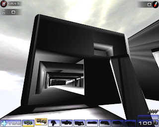
Obama office was built base on 2 sclupture things which are intersecting and creating the uniquenes of its shape. It is also wanting to suggest the quality that U.S.A president as the most influntial country to the western and eastern world by showing its shape, binding together as a unity. Moreover, the overall whiteness want to suggest the clarity as well as cleaness, which may give more concern in its structural quality, without any color and pattern distraction. The shape of it also want to suggest the security as well as the positve energy in the Office, which mainly may show the quality that Obama office has. The interior is showing the visible ribs of the structure suggesting the quality of superiority that United State of America has.


Prada Office
Miucci Prada Office has the quality of minimalize, elegant and strong. the quality of minimalize may be suggest from the shape of the building that has simple geomatric shape, without any other pattern and decoration applied in the building. The curve line was applied as part of interior to give the sense of contrast with its exterior, so that the building give the power of Prada from its outside form, and its feminism from its curvy interior decoration. Elegant may be suggested from its shape of sharp ages which is dominating the whole exterior of the building. The quality of simplisity is very strong in the building and may suggest the quality design of Prada has in her design.


Meeting Space
The meeting space is place inside the bridge. The interior of its dominating by curvy and natural shape. It is made to give the sense of relaxation for the client(Obama and Prada) as their very busy daily activities. The dining table and sofa is made in simple way and in organic shape, having the same order to relax the client, moving away from their daily busy daily activities. also the whiteness is dominating the space. White is used to built the relationship within the whole design(two offices, bridge and meeting space)


Bridge
The Bridge in modified, mostly in the middle of the original bridge, mainly to create the space for people inside the bridge itself. The bridge is constructed in very simple shape to balance the whole design. The Bridge has two main purpose, which to connect the offices as well as the place where the two client meet in the meeting space, which is place in the middle of the bridge.


Overall Look
The whiteness, simplicity and geometric shape are dominating the look of the design. they are created avoiding the complex shape of grid line to build the good harmony within the design itself.

Dinning Table and Elevators

Elevator of Obama
It is design like a gear, in which obama stand in the centre of it, suggesting that he has become the one who has control of the power. Also, there is a sense of secure in the design, suggested by its shape which being rounded by ribs like materials.

Elevator of Prada
The quality of Elegance is quite strong in the design, suggested by the shape of it which looks like diamond.

Dining Table
Again, it suggests the quality of simplicity. The simplicity of the design helps to gain the togethernes as well as the relaxing moment between the two client. Moreover, the shape of it may caused the two clients sit closer and may has more intimate conversation between the two.

Final Draft


Prada Office


OBAMA Office


THE MEETING SPACE


The BRIDGE

Peer Marking

Marking

First attempt of Obama and Prada Offices


Prada Office
Carrying the idea of ELegant, Strong and Light in the design of the Office.


Obama Office
the square box, with the walls being layered outside the wall is created in order to give the sense of secure as well as the sense of power for Obama.